 In today’sPubletariat Dispatch, book designer Joel Friedlander discusses the current design limitations of ebooks on the iPad.
Last month, Joanna Penn put together a useful blog post on How To Publish Your Book On The iPad. In the article she points out the various ways you can get a book onto the iPad, including:
- Smashwords by creating a Word file that conforms with their requirements (spelled out in the 37-page guide, by the way)
- Kindle which is a kind of back door onto the iPad through the Kindle for iPad app
- Lulu the author-services company that is, like Smashwords, an Apple Aggregator for the iBookstore.
- Aggregators beside the ones mentioned above. At last count there were eight, and there’s a handy list in the article The Apple iBookstore and You put together by Scott Flora, executive director of SPANnet.com.
What Happens at the iBookstore
Over the very few days I’ve owned an iPad I’ve become accustomed to the somewhat “sealed” environment that Apple presents you with. The iPad uses the same operating system as the iPhone, so it’s very familiar.
Enlarged to the size of the iPad, it becomes more obvious that Apple is providing a seamless, regulated and safe environment for its customers. This is one of the chief elements that will—in my opinion—make the iPad successful. It is a major step toward making computing—at least a robust type of “accessory” computing—accessible and attractive to a large audience. More on that later in the week.
But having gone to all the trouble to get your book onto the iPad, what can you expect? How do the books translate into the ebooks that buyers will see when they go iBook shopping?
I had a look at several possibilities. iBooks use the ePub format, similar to the Barnes & Noble Nook, the Sony Reader and many other eReaders.
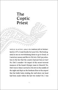
First I downloaded a free sample of Lisa Alpine’s Exotic Life which I designed, and which was featured on my blog recently. Here’s what the chapter opening pages in the printed book looked like [click on any image in this piece to enlarge]:
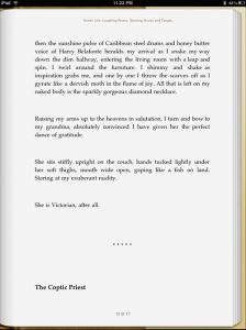
I knew the graphic probably wouldn’t survive the trip through Smashword’s famous “meatgrinder,” the engine that chews up your formatted Word file and spits out eBook formats left and right. But I was surprised at just how much damage had been done to the book. It was unrecognizable:
Exotic Life ($9.99) is the first book I know of that I designed that’s on the iPad. I’m not jumping up and down in joy, since nothing of the design remains. At least the cover artist gets a nice little jpeg to represent his work. You can see here all the hallmarks of the iBooks typography we saw in the first look at this platform. Lack of hyphenation, very restricted list of iPad fonts, awkward typesetting and big “rivers” of space running through the body of the type.
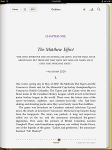
Next I turned to a book from a major publisher who, presumably, would have far greater resources to bring to bear on file translation. I snagged a sample of Malcolm Gladwell’s Outliers, $12.99 from Little, Brown. Here’s what it looks like:
Although this may be mediocre typesetting, and the same problems with the very limited palette and most inappropriate iPad fonts, this is a much better looking page. At least you can recognize that it’s a chapter opening.
The Kindle Game
Amazon, who boasts over 500,000 titles in its Kindle Store, quickly moved to release a Kindle app for the iPad. This neat ploy placed Kindle “behind enemy lines,” so to speak, to make use of the popularity of the iPad to sell Kindle books.
(And before your rush out to go subscribe to TheBookDesigner.com on your iPad, have a seat. All of the subscription products like newspapers, magazines or blog subscriptions are available only for the Kindle itself.)
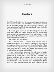
I grabbed a copy of something called The Hunters by Jason Pinter ($0.00—love that Kindle store!). Here’s a chapter opener:
I guess at least you could say it looks like a book. Notice how the Kindle pages have been greyed-out, perhaps to make it look more like the eInk pages of the Kindle itself. Of course, the Kindle for iPad app has none of the polish and sophistication of the iBooks. No sexy page turns, for instance. In fact, there is only a nod to “pages” at all. It looks like you are reading a continuous “roll” of paper with pages printed on it.
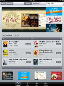
I want you to see, before I close this look at books in the iBookstore, what the “storefront” of the iBookstore looks like. This is the smooth and careful environment Apple has created for this ultimate experience of computing convenience:
This is slick, pared down to essentials, designed to invite your participation.
But overall, despite the beauty of the iPad itself, besodes its convenience, and despite all the dynamic possibilities it presents, when it comes to the iPad fonts and typography, when you tear off the wrapper, we are still in a very primitive phase of ebooks.
Under the polish, things are pretty crude. But will that slow down sales? Will the poor look of virtually all these ebooks deter the wide acceptance of eReaders that many people are predicting?
What do you think?
Takeaway: There are now many ways for self-publishers to get into the Apple iBookstore for the iPad. Unfortunately, the ebooks haven’t gotten any better.
This is a reprint from Joel Friedlander‘s The Book Designer.
